Pitch Project

RNIB Re-brand

Brief: The Royal National Institute of Blind People (RNIB) sought to revitalize their brand but lacked a clear direction. The following work was created for a pitch, specifically showcasing my design contributions to the project.

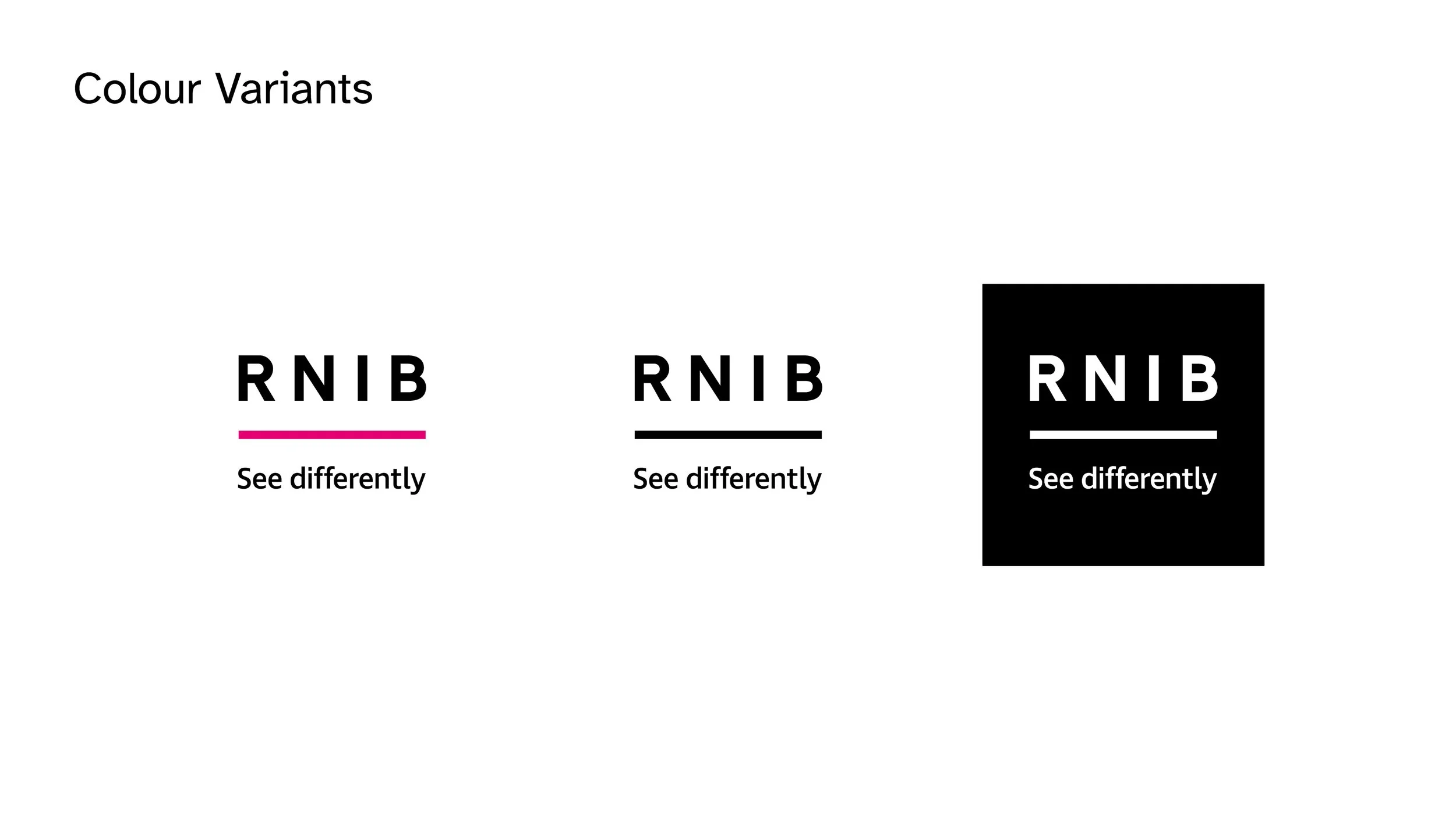
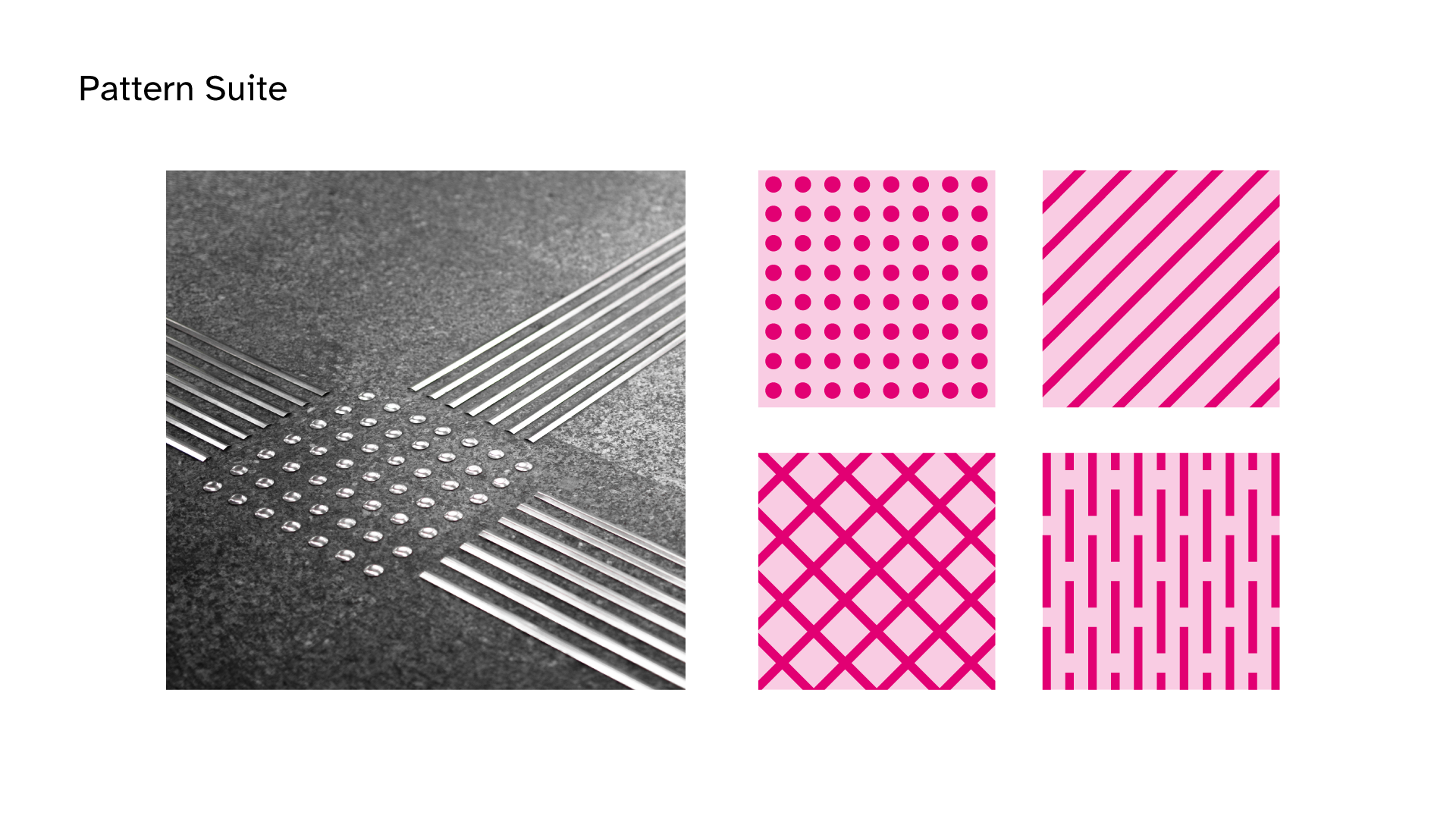
Outcome: We streamlined their colour palette, refined their logo variations, and introduced a distinctive, new typeface. To complement the typography, I developed a suite of icons and patterns inspired by tactile paving. Additionally, we reimagined the pink line within their logo giving it more purpose and we applied it’s new activist behaviour to the real world.

Head of Design: Ben Edwards
Designer: Hannah Neville
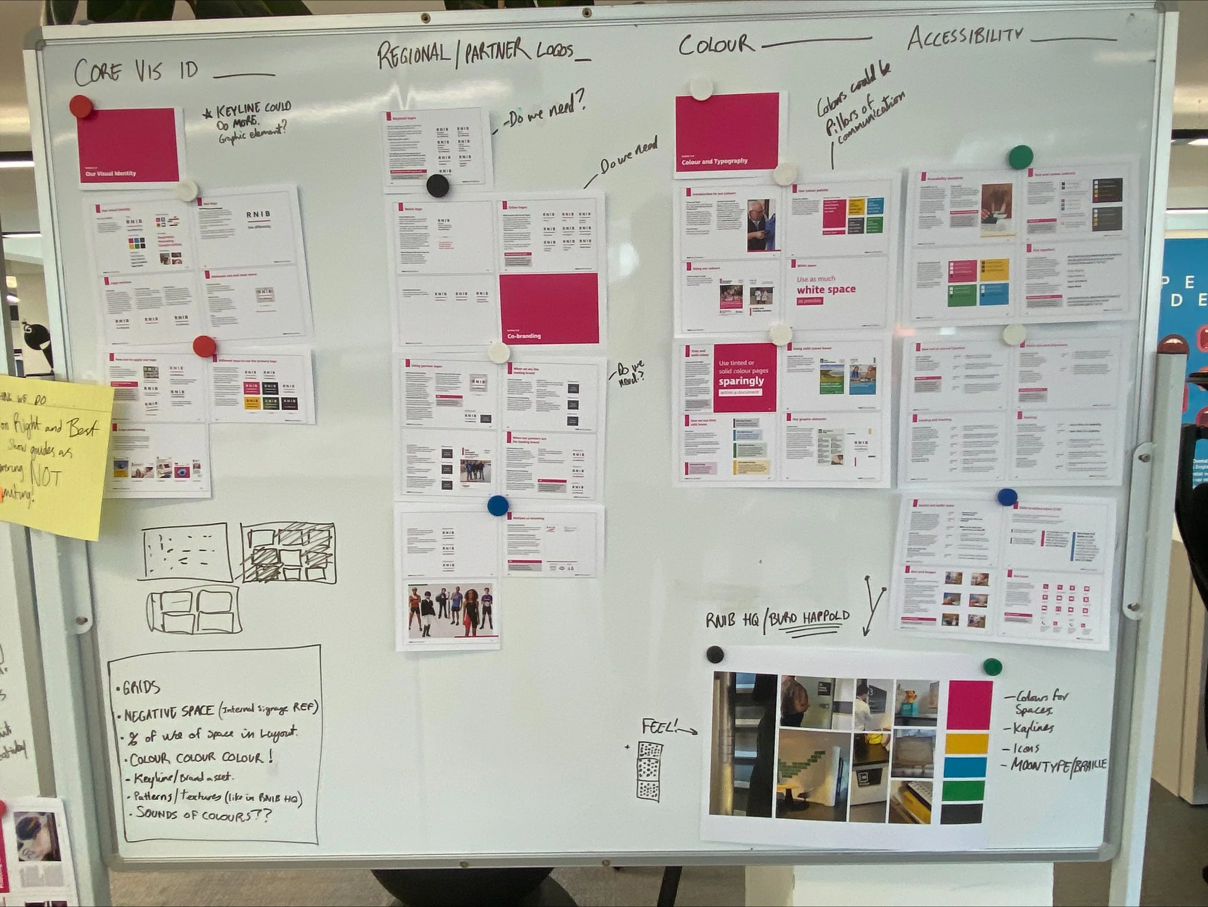
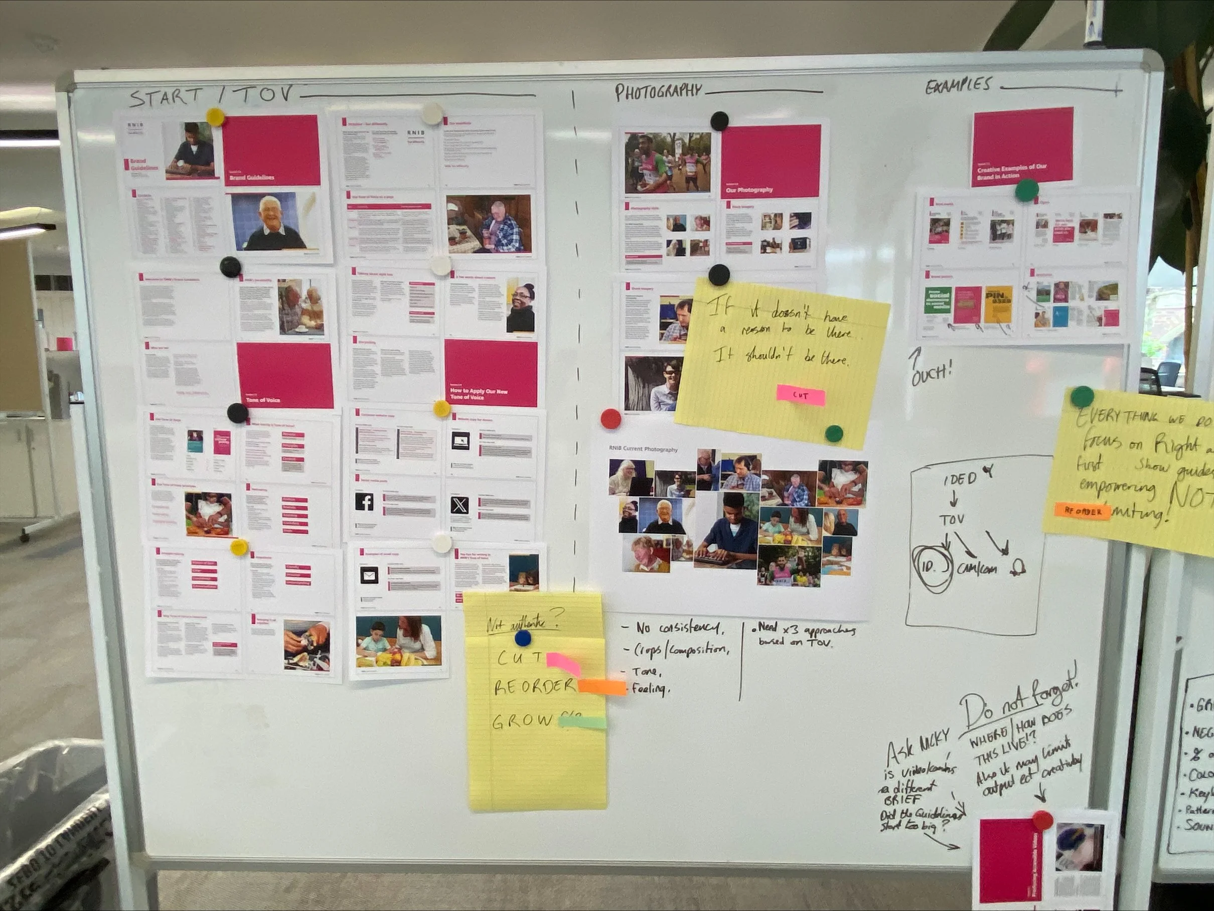
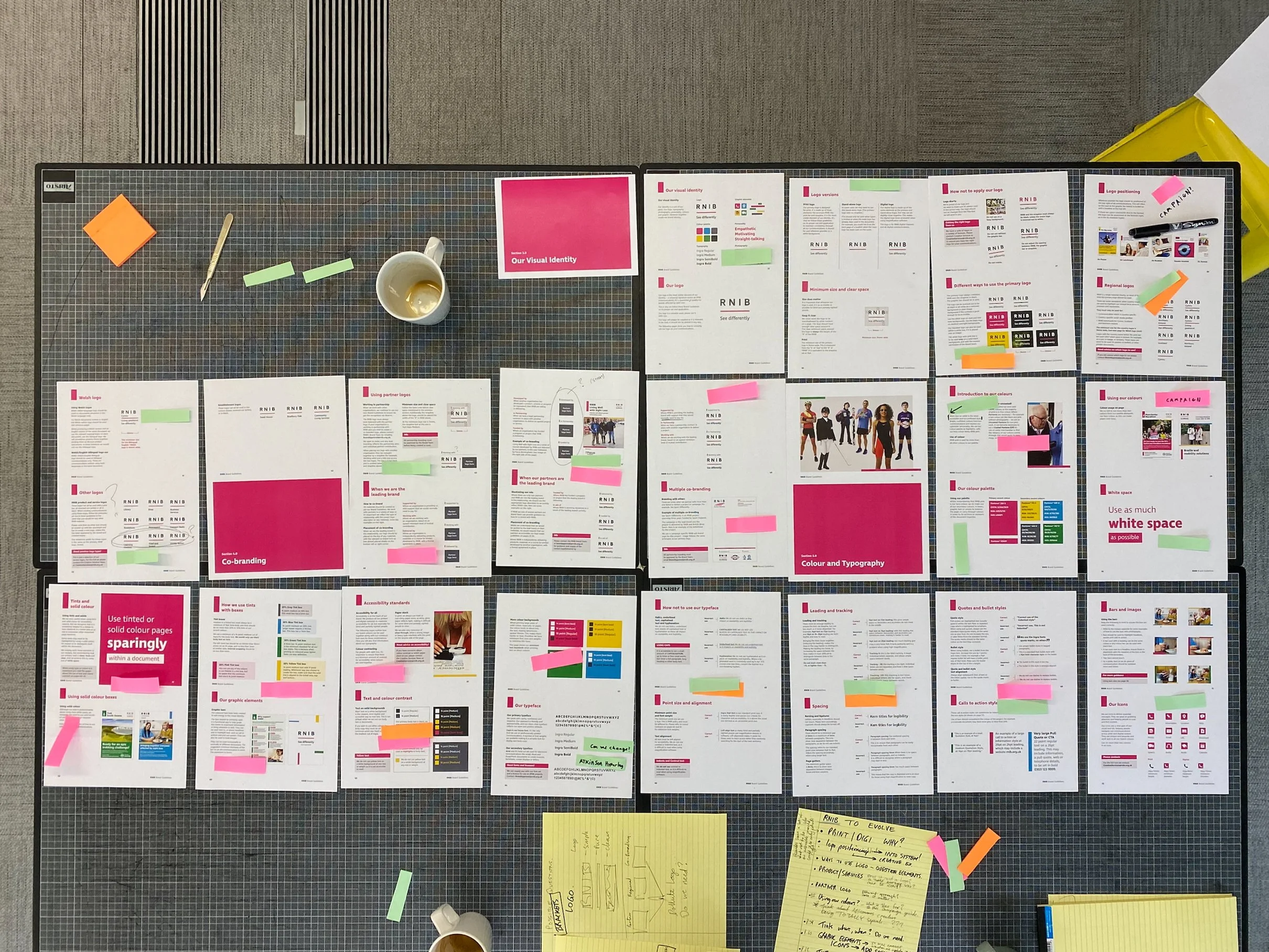
Three RNIB logos with different color variants, each with the text "See differently." The first has a pink accent, the second is black and white, and the third is white text on a black background.
Graphic design presentation of the Atkinson Hyperlegible typeface featuring typography, color schemes, logos for RNIB regional branches, iconography, and accessibility patterns.
Large bold text 'ER79j' with annotations comparing 'Average typeface' and 'Your typeface' differences, titled 'Typeface' on a white background.
Text reads "Typeface Atkinson Hyperlegible" with highlighted letters and pink circles for emphasis.
Design guide showing FAQ icon usage with a pink question mark inside a speech bubble and alignment instructions.
Three Instagram posts showing the RNIB's campaign: one shows a hand using a Communiclock, another features a person standing outdoors, and the last has a message about making elections accessible.
Text "See differently" on a white background.
Railroad tracks with close-up view of passenger's shoes on a train platform, featuring the text 'See journeys differently' painted on the ground.